Designing for Memory
Project: Bachelor thesis at inUse
Project length: 12 weeks
My role: UX designer and researcher
Materials: Sketch, Photoshop, pens, papers and post-it notes
INTRODUCTION
In the field of interaction- and user experience design, there is an important correlation between experience and memory. The aspect of a positive impression and memory design is becoming increasingly important in a world in which interactive solutions are competing to keep users’ attention, and to persuade users to maintain their interest in a specific product. To design for a positive memory or relatedness in a sign-up process could be the first crucial step for a user to become a loyal and returning customer. To create relatedness and a positive memory of your solution/product could be the difference between users continuing using it or moving to the next one, resulting in success or failure for your service or product.
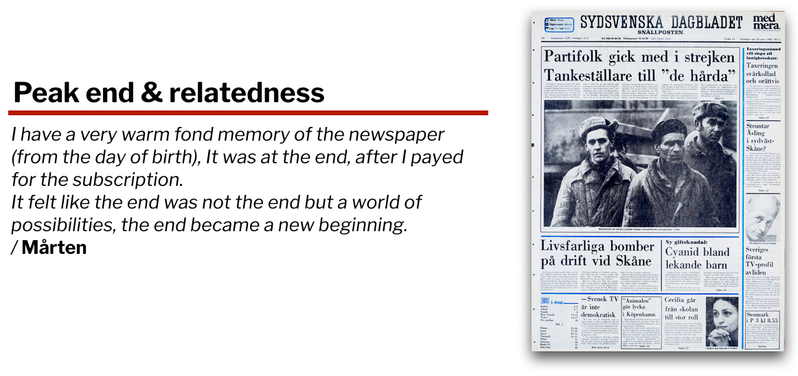
The aim of my thesis project was to explore how different design elements, such as tonality of language, UI-elements, narrative imagery and historical newspaper frontpage from the user’s own date of birth, could form a positive memory of a sign-up process for the newspaper Sydsvenskan. My thesis got highest possible grade VG from Malmö university and can be downloaded from here.
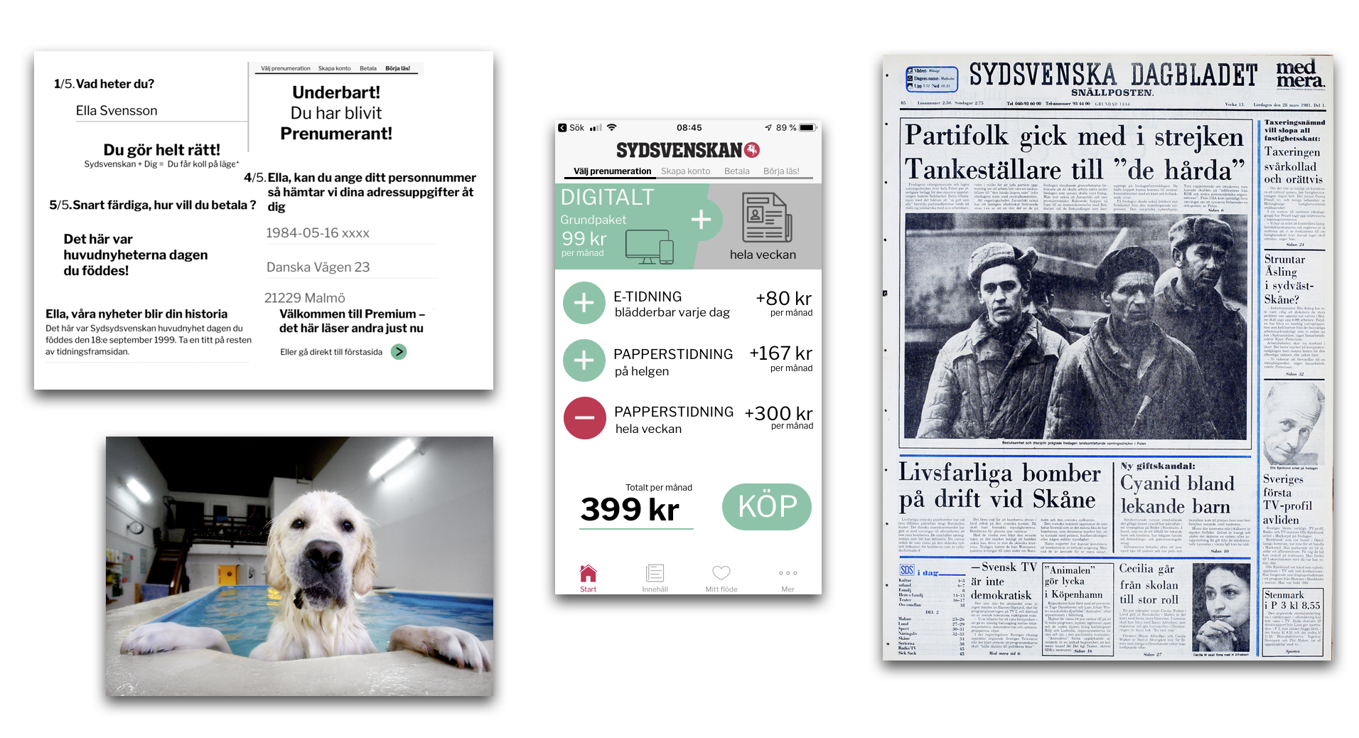
Triggermaterial for the prototypes: conversational language, narrative imagery, UI-elements and historical newspaper front page.
I did this by sketching out and creating three different interactive prototypes with personalized sequenced trigger elements. I used these prototypes in an explorative way to conduct usability and user experience research to understand what people actually remember over time.
In doing this I used insights from influential designers such as Luke Wroblewski, Kathy Sierra and Samuel Hulick from useronboard.com as well as theories such as the peak end-rule (a theory of how to design for experienes that leave a lasting and positive memory), memory design and how to design for relatedness.
The result in short
In short my result was exciting and also surprising. It showed that with small means it is possible to design an experience that travels from the main purpose of a sign-up transaction to the user experiencing friendliness and relatedness with a product or service. This means that design actually affect people’s memories in certain ways intended.
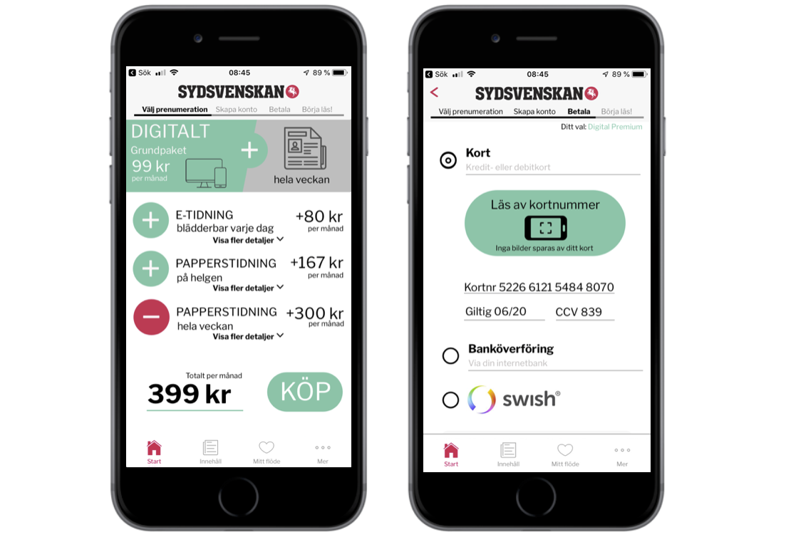
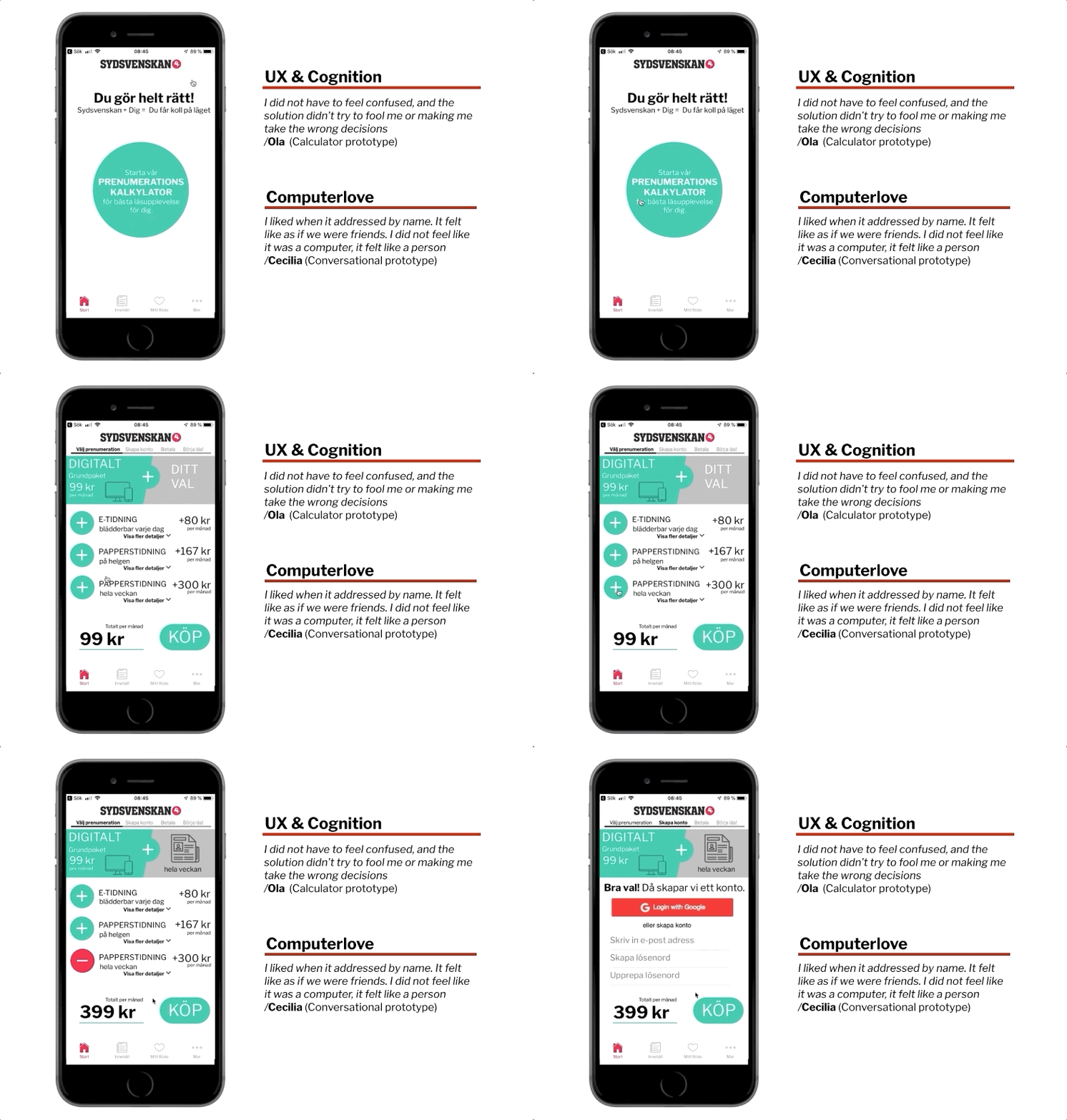
Out of the three prototypes, the Calculator sign -up prototype was the one that people liked and remembered best. It had an element of agency for the user and a helping and clear UI. One of the trigger elements I used was
conversational language. The conversational mode proved to trigger the brain into experiencing the prototype as more of a friendly person, not only a computer. Another trigger element when signing up for subscription, a newspaper frontpage from the user’s date of birth, also proved to be successful. This element was something that the users experienced as a postive and personal surprise that also generated relatedness between the user and the product.
THE DESIGN PROCESS
Gaining knowledge and sketching out ideas
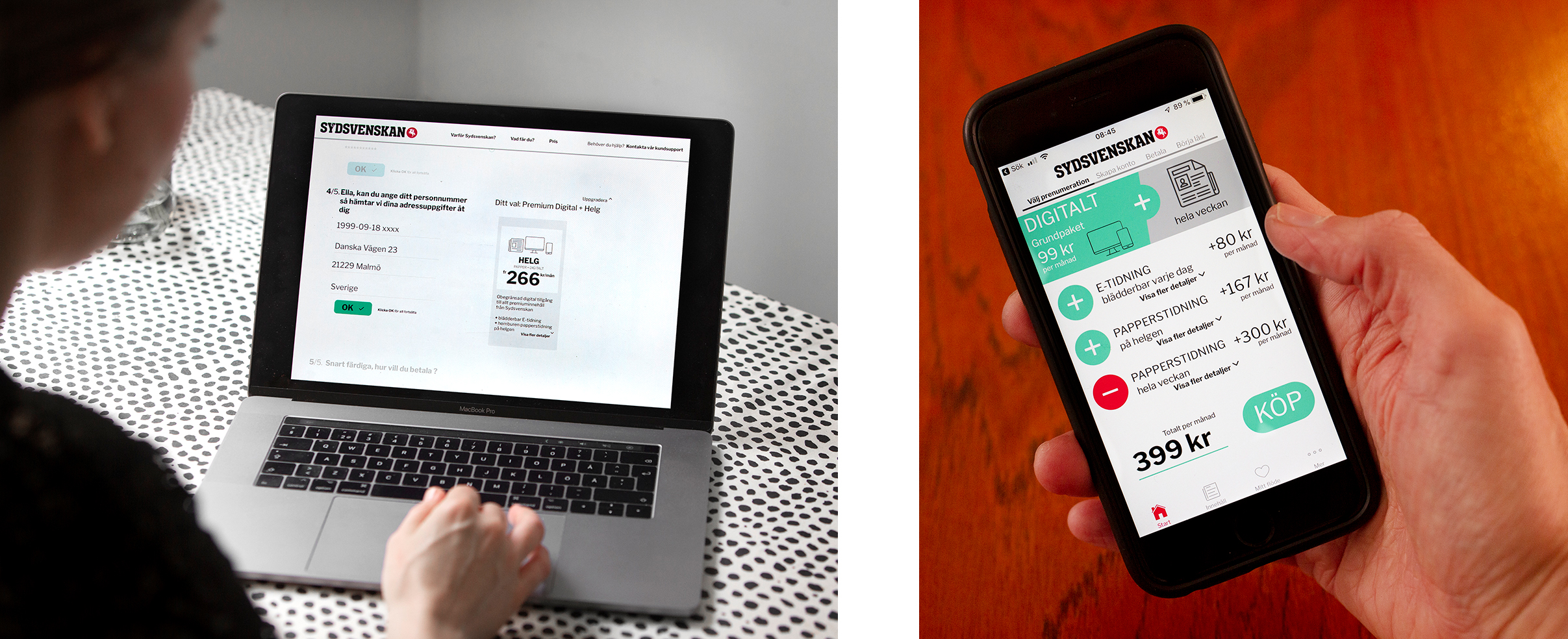
Based on previous theories, knowledge from influential designers, my interviews with people at Sydsvenskan and Bilder i Syd, inspiration from New York Times successful subscription solution (they managed to increase the number of subscribers from 1, 5 million 2016 to 3 million digital subscribers in 2019) and Sydsvenskan’s current solution, I sketched and designed three prototypes. I redesigned Sydsvenskan’s current solution but kept fonts, some icons and colour schemes. As the purpose was to test aspects that I wanted to gain knowledge about the prototypes were not intended to be perfect working solutions, sometimes the aim wa seven to deliberately provoke certain reactions. I also experimented with obviously bad ideas, in order to understand if they could generate memories.
Thereafter I went on to do the interactive prototypes for usability and memory testing in Sketch.
Usability and user research
I interviewed and made usability tests with nine people (19-46 years old) with different backgrounds, but with the common thing that they could imagine themselves subscribing and paying for a news service.
What did they remember? Interviews 1-2 weeks later
Maybe 1-2 weeks doesn’t seem to be a long period, but by this time memory of a usability test experience have been fractured in the human mind. This also proved to be the most interesting and most rewarding part of the project, to study what aspects of the prototypes that stuck in people’s minds.
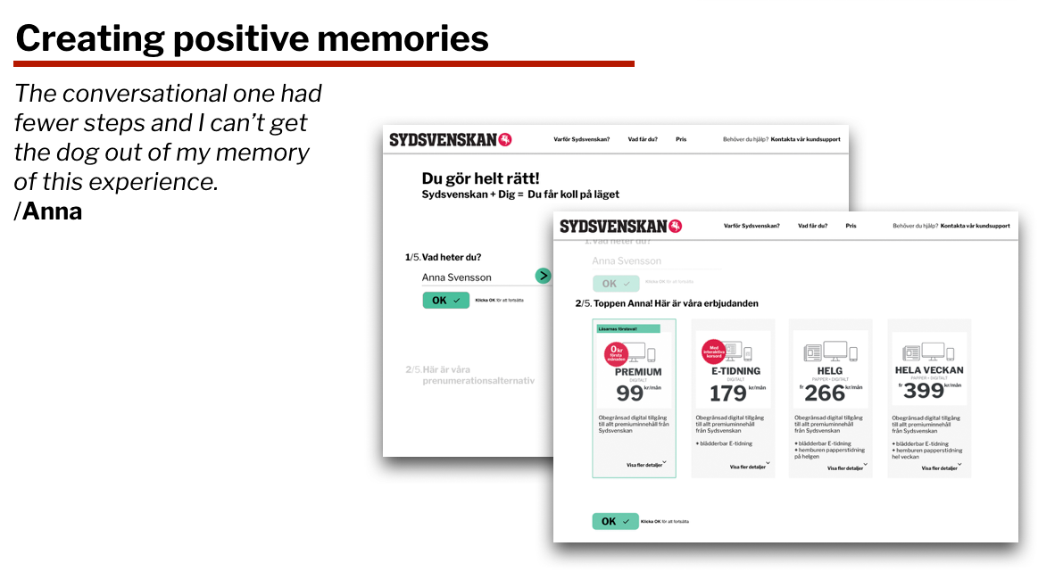
When doing the first usability test and having to choose between the different prototypes the participant Anna reflected on the number of steps: “I would have chosen the conversational one. It had more steps, but a friendly personal tone and I liked the image of the dog”. When later being interviewed about what she remembered, more steps had turned into fewer.
Presenting to stakeholders and colaborate partners
In this project I had three different collaborative partners: Malmö university, inUse and Sydsvenskan. All three of them were interested in different aspects of my result which meant that they all got individual final presentations.

