MinnesManicken
Course: Visual Communication
Project length: 3 weeks
What I did: Ideation, Project management, User research, Visual design, Visual documentation.
Material used: Illustrator, Photoshop, Pens and paper, Camera, Final Cut Pro
INTRODUCTION
In the Visual Communication course we were given the opportunity to work with an own idea for a service, application or similar, and to visually communicate it. I chose to work with a project called MinnesManicken, a solution for children in daycare, their parents and the staff working there. The idea came from my own experience of not knowing what my child was doing and thinking when spending her days in daycare, and when asking she responded “I do not know”, “I can’t remember”, or “It is a secret”.
Also the information from the staff concerning my child, activities and important dates were not communicated in a cohesive way because of lack of resources and time constraints.
So the design opportunity I saw was to create a solution that was interactive, playful, user friendly, and that could encourage a narrative documentation of the time spent in daycare and communication around activities. I wanted it to be easy to use both for the staff and children, and not something that would demand to much time and effort. What I learned from this project was different ways of visually communicating an idea and performing user research for design.
MY DESIGN PROCESS
Research and a video documentation
Intially, I searched the market for similar solutions and found Förskoleappen that had some of the features that I was looking for but lacked involvement from the children themselves. (Tyra that seems closer to my thinking was not on the market at the time of research)
Then I talked to the staff at daycare about their current situation in terms of documentation and communication, what issues and obstacles they saw. They were positive to a digital screen solution, up until now everything had been printed on paper. I also got permission to film when a father picked up his daughter. The only instruction I gave to him was that he should ask his daughter “- what have you been up to today?” and then just see what happened.
When analysing the film, it confirmed several of my own experiences about the situation and the narrative abilities that children at that age have.
Raw sketches and Solution storyboards
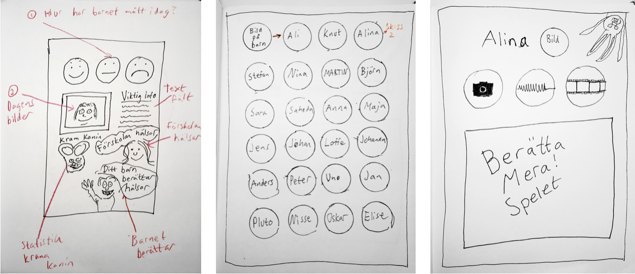
Here I quickly sketched out some of the initial basic functions for child-interface.
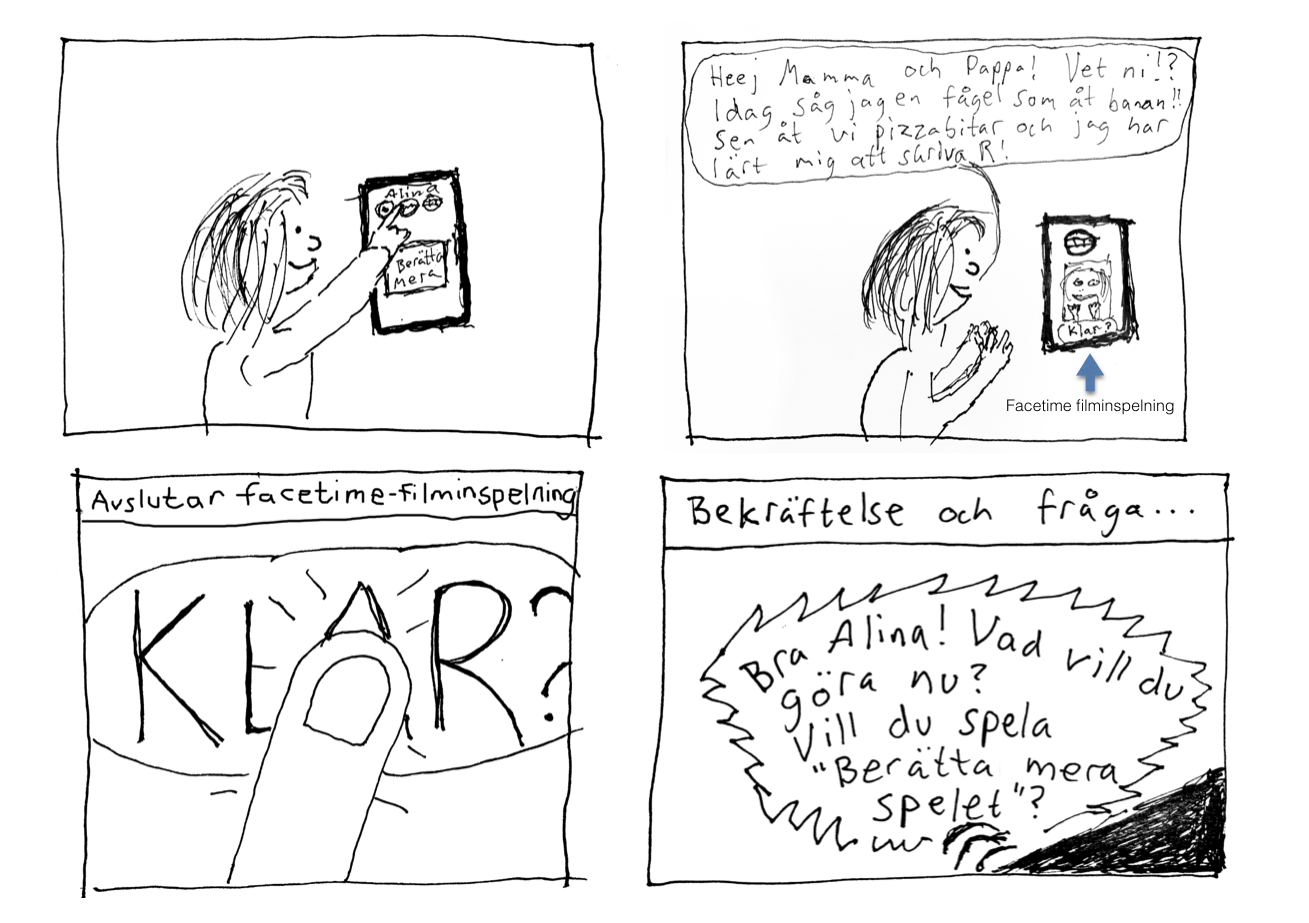
I also sketched out some simple solution storyboards, to show how the application could work from a child’s perspective when recording a message intended to be viewed by the parents later on…
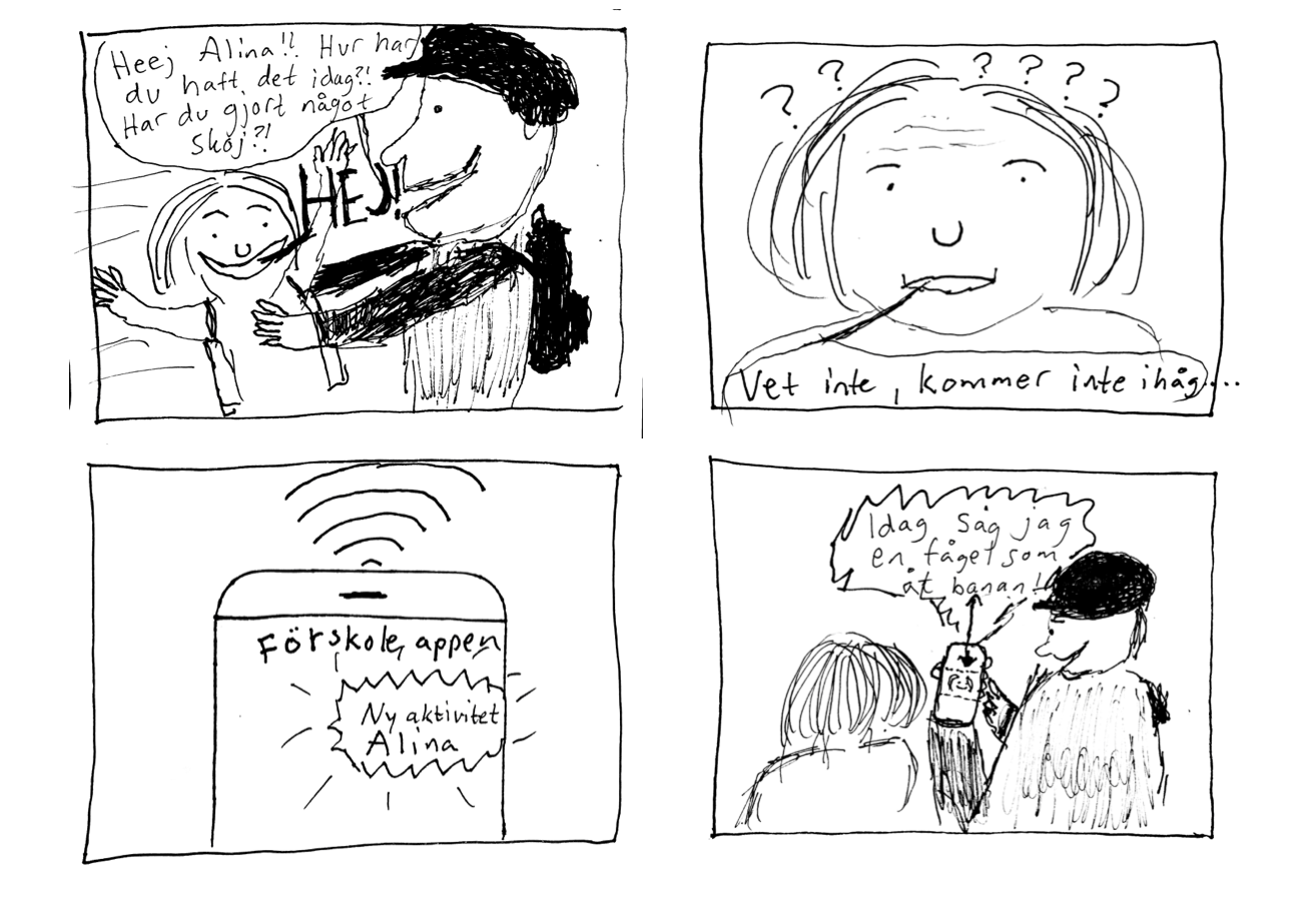
…and from the parent perspective getting in the moment captures from the child.
Annotated photos
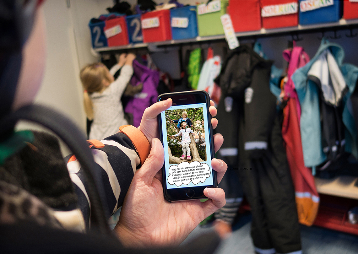
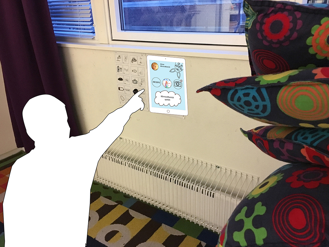
I also annotated a series of photos taken in a user situation. Here is one picture when a parent is picking up a child and they look at what has been documented during the day.
From a thought of user situation at daycare.
Flowchart
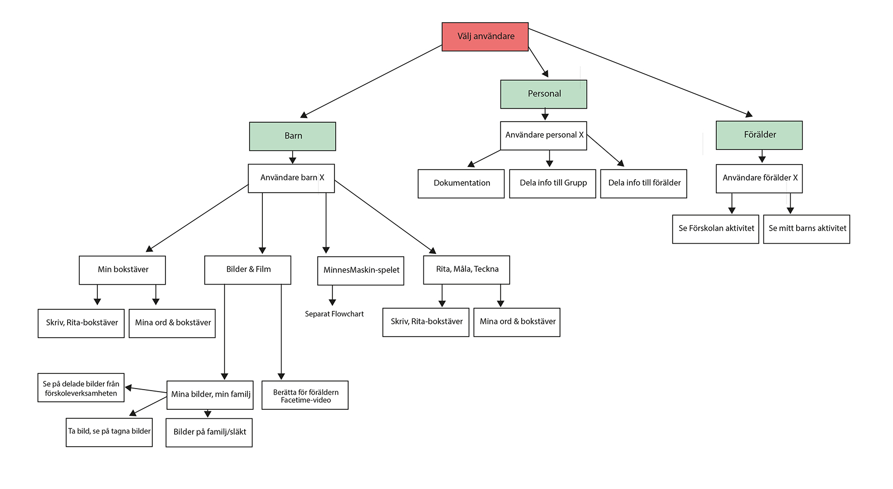
Here is an initial flowchart of the basic structure of functionality.
Moodboard
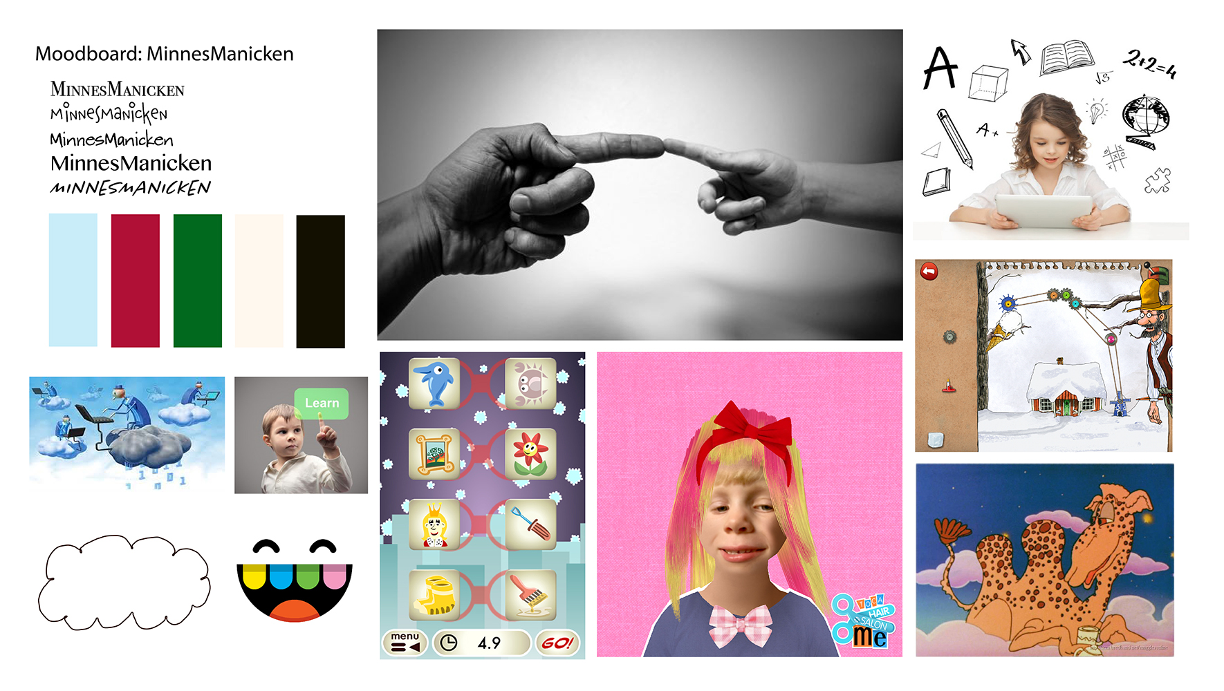
This moodboard sums up my ideas around MinnesManicken. I deliberately want it to be designed in a simple and naive way, borrowing aesthetics from apps made for children.
Personas
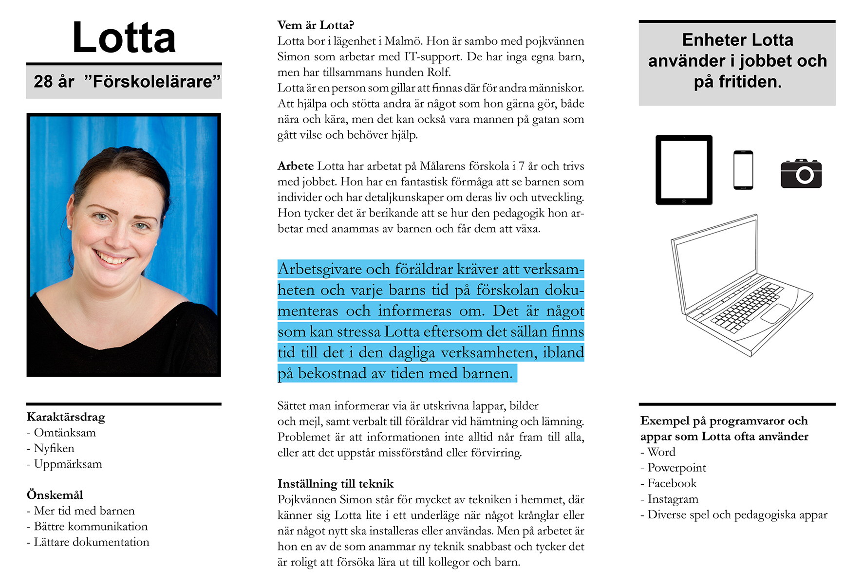
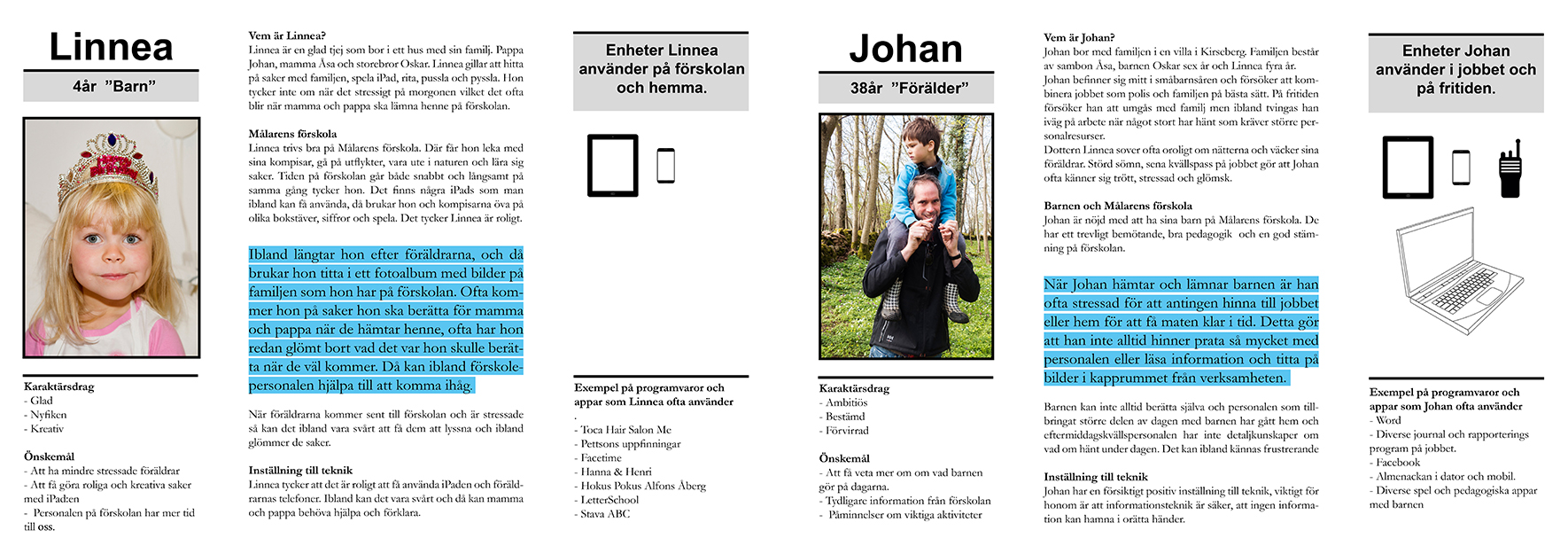
I also did three personas representing the three main groups of users.
Wireframes
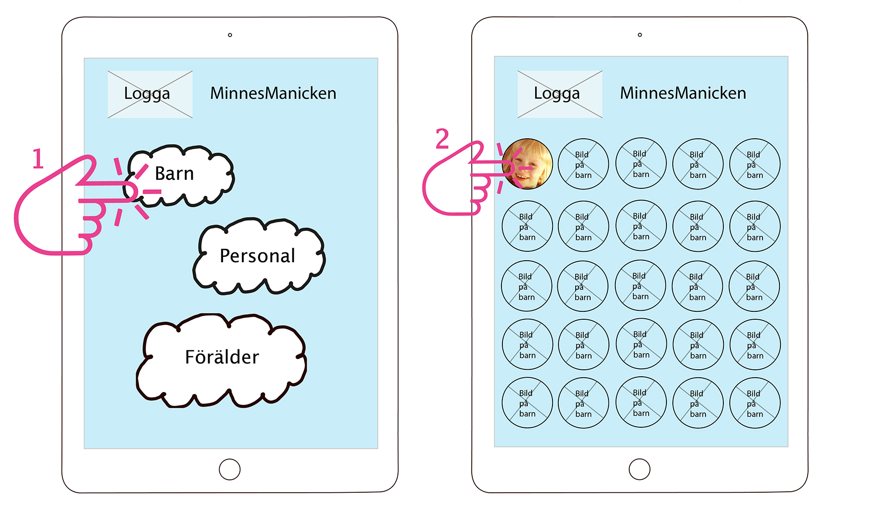
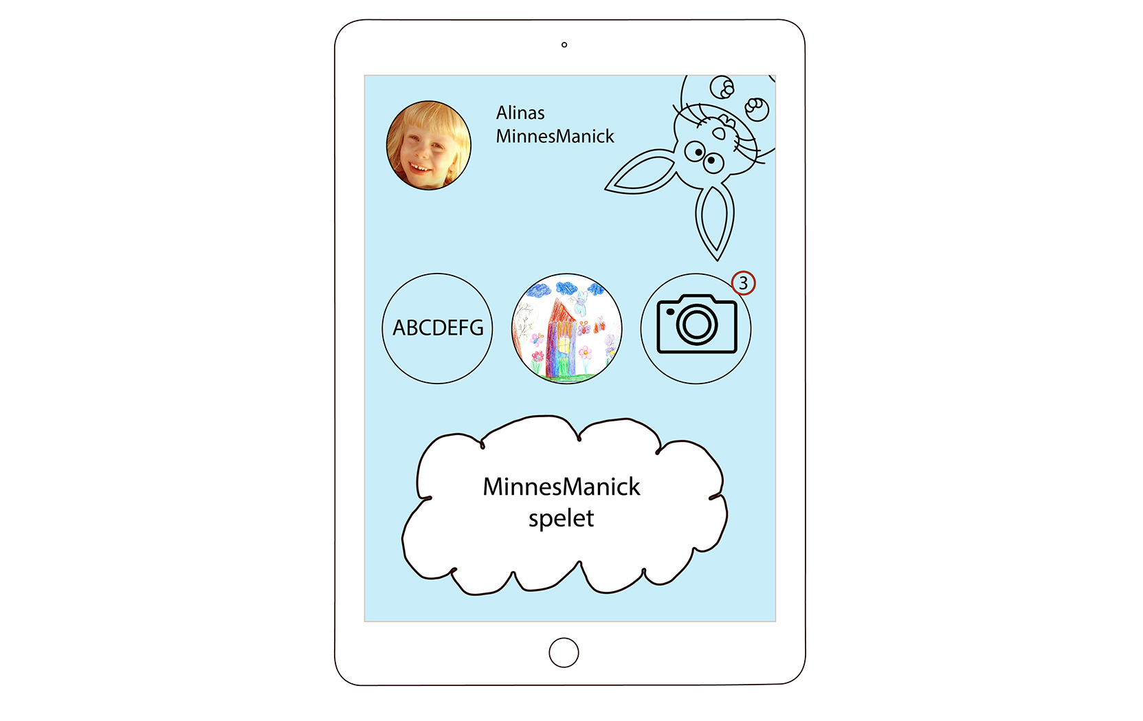
Initial wireframes from child interface, where you end up looking at the features for the child to create narratives: Letter practice, drawings, picture and filmmaking and also a game that could generate a narrative about the child’s day at daycare.
